-
Find a Post
-
-
Post Categories
-

-

-
- "I am enough of an artist to draw freely upon my imagination. Imagination is more important than knowledge.... fb.me/1CgRTCYFq
- Mod Podge Tip of the Day: To reduce tackiness, spray project with a clear acrylic sealer when complete.
- “Once you replace negative thoughts with positive ones, you’ll start having positive results” - William Nelson
- Craft Tip of the Day: Use thumbtacks on the back of things you are painting so they dont dry and stick to the surface!
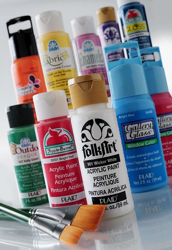
- An employee here at Plaid made this lovely art canvas using FolkArt and Apple Barrel paints. I love working... fb.me/1Yd3bYh33
-
-
Grab Our Button
-

-
Legal Disclaimer
Apple Barrel, FolkArt, Gallery Glass and Simply Screen are registered trademarks of Plaid Enterprises, Inc. Norcross, Georgia, USA. The information in this blog is presented in good faith, but no warranty is given, nor are specific results guaranteed. -
|