


I’m seeing a lot of brights this summer and I like it. One thing I’m noticing is that the brights are typically on a neutral background, or at least combined in some way with shades of black and gray. It’s very pleasing to the eye, don’t you think? I pulled this latest palette from the most recent Crate & Barrel catalog, and their summer collection completely embraces some fun uses of brights.

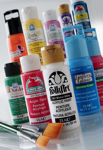
This palette was created using Apple Barrel acrylic colors (clockwise from upper left): Apricot, Kiwi, Plum Kiss, Country Gray, Black