


My absolute favorite color in the whole world is blue, and I try not to “hog” too many of these Tuesday posts with it. I realize that it’s not everyone’s favorite color – yet it’s difficult to deny the tranquility of shades of blue. When I spotted this Swedish seaside layout in Cottage Style, I loved how all of the blues came together with white to make a very peaceful and calming environment. The article also mentioned a “return to painted pieces.”

With all of these beautiful blues in one spot, you can imagine I wanted to put together a palette. My thought is that you might not use them all together, but you could use any of them with white, or you could use two together for a tone-on-tone look to give your house some Scandinavian seaside charm.

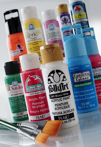
This palette was created using FolkArt Acrylic colors (from left to right): Light Blue, Light Periwinkle, Periwinkle, Brilliant Blue